Chapters
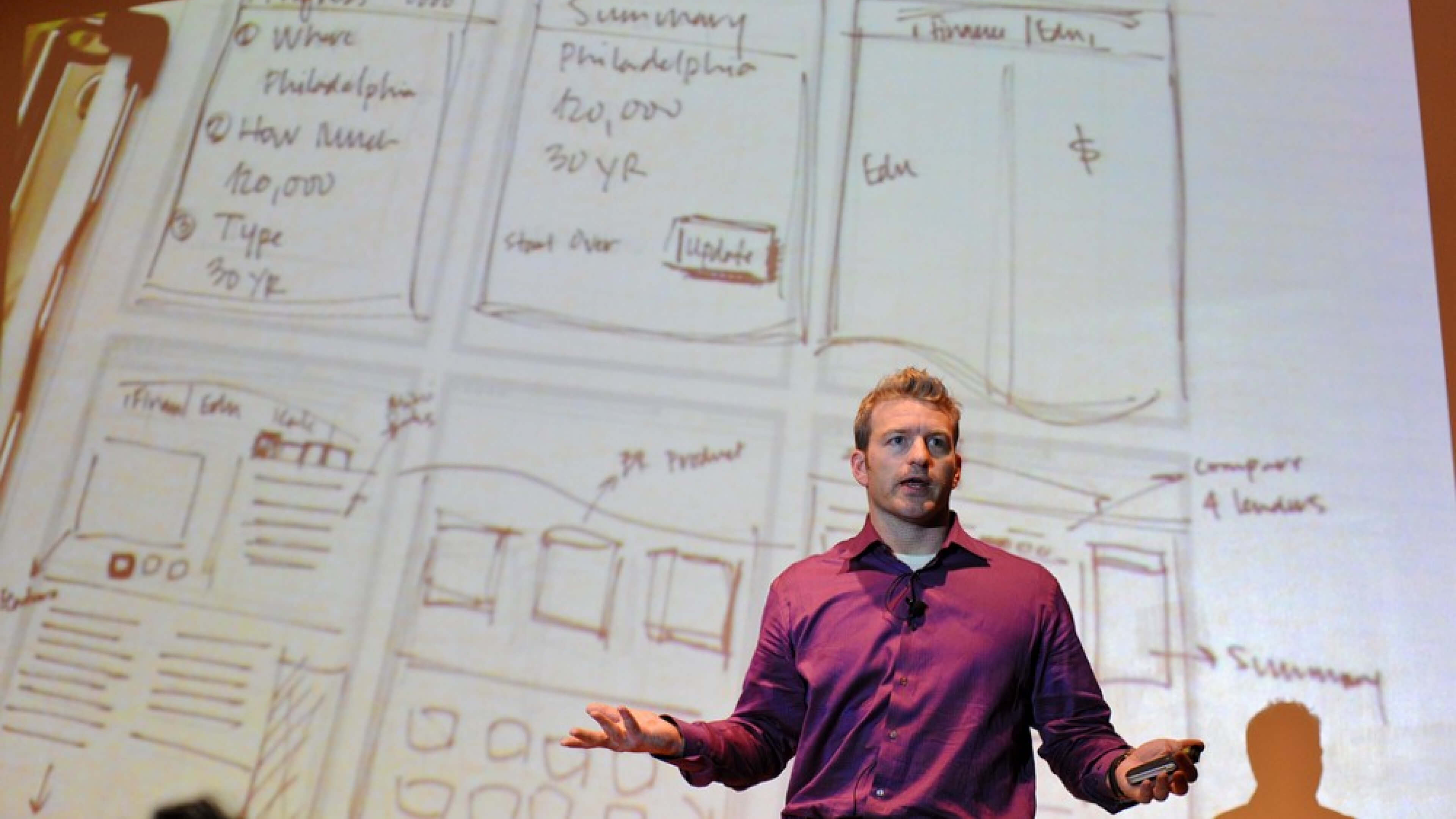
Tips for a successful co-creation workshop for your next design project.
Many business environments suffer from unproductive, toxic meetings, that last for hoooooours. If you’re just waiting to punch the clock at the end of the day, it’s probably a blessing when 5pm rolls around. But if you want to help your company or your client create something feasible, you will need some structure!
I used to go to a lot of meetings where I saw my co-workers or stakeholders digressing, mixing the current reality with science fiction and coming up with random ideas just to prove to everybody else they’re smart. I promised myself that one day, when I run meetings, I won’t waste even a minute of other people’s time.
After ending up as a UX Designer, and looking for inspiration for better ideation methods, I read Todd Zaki Warfel’s “Prototyping: A Practitioner’s Guide”. It was here I discovered the Design Studio Workshopping method, which I have used many times — each one with small tweaks, for improvement. Let me share some tips with you.
The Design Studio Method
The Design Studio is probably the most popular co-creation method among digital product teams. It replaces random brainstorming with a structure that allows team members to get crazy creative, yet stay on track.
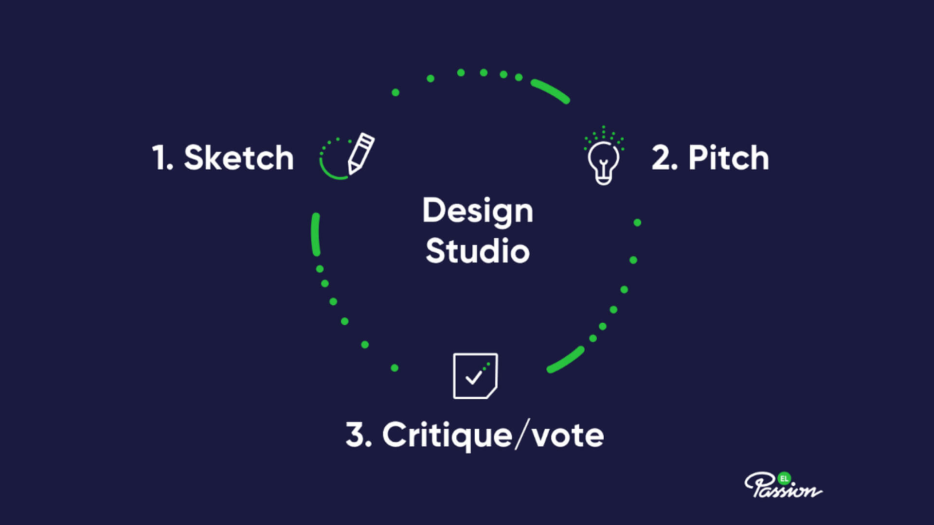
The session consists of a couple of short activities: sketching, pitching, critiquing and voting. Each takes just a couple of minutes to conduct, but they are iterated many times throughout the day (more on the activities later).
It’s basically a very dynamic, fun day at work where each team member grabs a sharpie and draws many solutions to a given problem, then pitches their ideas to the rest of the participants. All of them get a chance to give and receive feedback on their proposed solutions, as well as gather inspiration from around the room.
So why would you decide to conduct such a session, instead of a regular brainstorming one?
Everybody Wins
Co-creation sessions are a great way to speed things up in the beginning of the design process. It doesn’t matter if you’re working on a marketing campaign concept, a website, an app or a service — it will still help you get through your team’s ideas quickly and improve communication.
There are situations when your stakeholders claim they don’t know anything about the design process; that they didn’t get a chance to request changes and they want to redo everything now. Well, if you invite them to co-creation sessions, this excuse for ego-pumping is compromised.
During a sketching session, when your participants critique ideas, you will learn a hell of a lot more than you would sitting alone at your desk. The design will be informed in real time, allowing you to avoid costly mistakes later on. You, as a designer, or a product person, may not know everything about the domain you’re designing for, so having this instantaneous feedback loop is a gift from heavens.
Running a Design Studio
Invite the Right Crowd
First off, you want to invite the right people to your session. Think ‘cross-functional’ — who has any stake in the project or could provide participants with domain knowledge? That usually means: designers, developers, marketing, sales, customer support and business stakeholders. Inviting customers is a great move too!
Design Studio is especially effective when working for a client— it’s a great way to engage them and minimise annoying last-minute changes. It doesn’t matter if they have any prior experience with design or drawing.
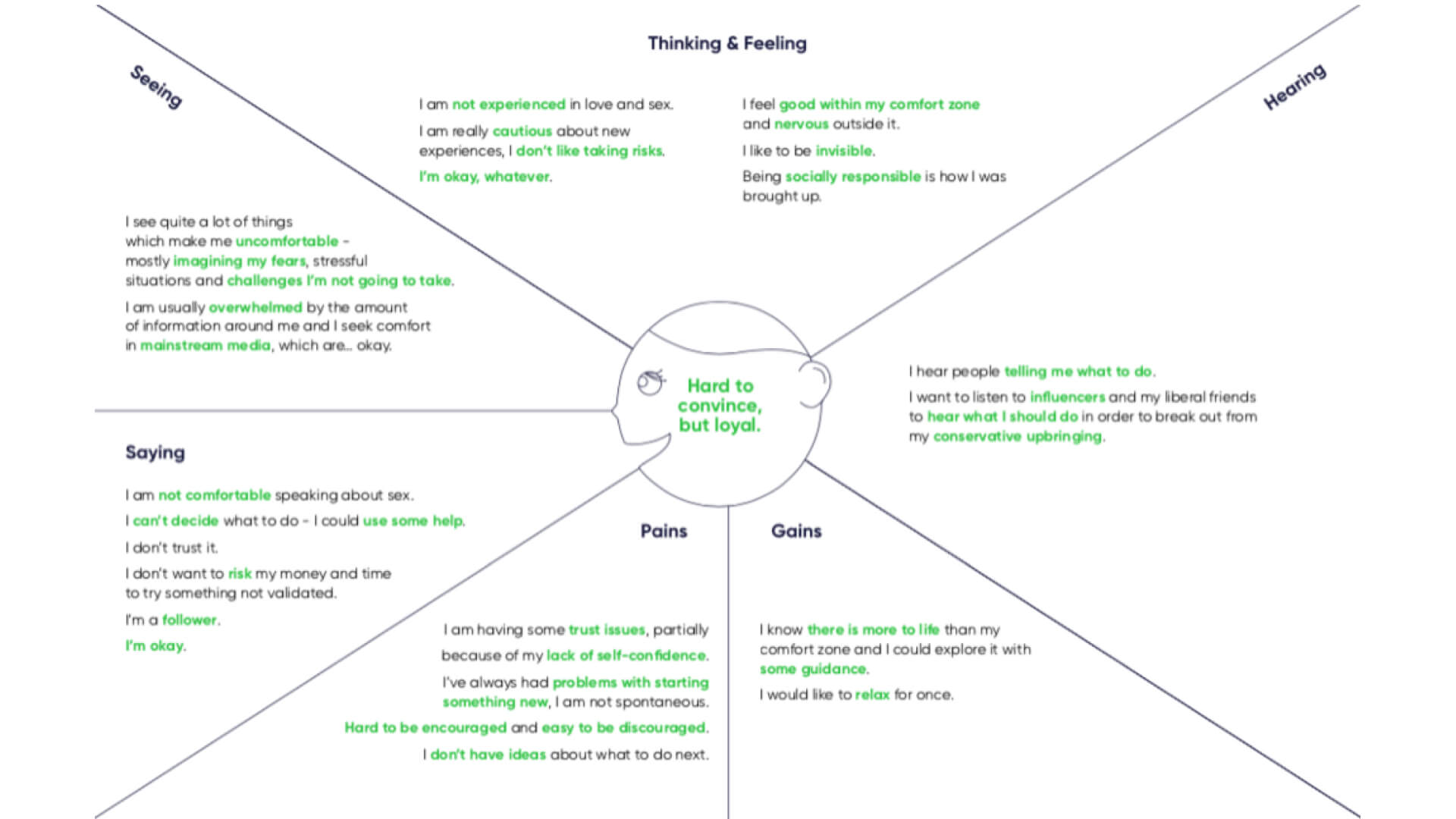 Empathy maps are amazing for getting your participants in the right state of mind.
Present a Design Brief
Let your participants know of any key insights you gathered prior to the workshop. In order for the session to be useful, it’s good to set up some constraints to frame the problem. I recommend putting up business goals, business constraints and personas on the walls. Having these on display may also spark some new ideas.
The participants should also know what the requirements are for each of the screens or components which you will be sketching out.
Run the Show
Each Design Studio workshop should have at least one facilitator who will act as a moderator, time-keeper, entertainer and a… DJ. Yep, it’s good to play some music in the background to break through awkward silence when everybody is busy sketching.
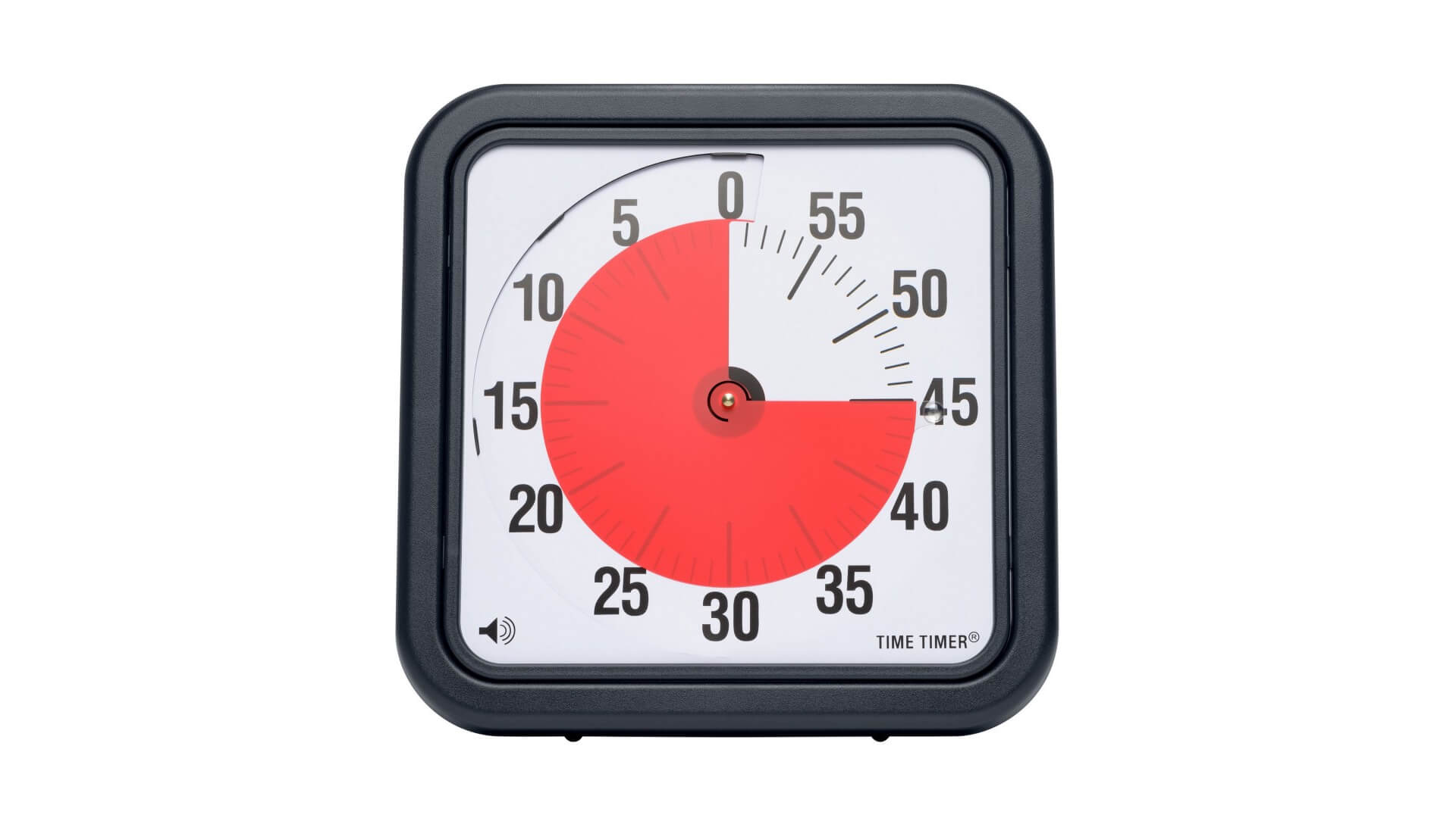 Time Timer is an awesome tool for any workshop. | timetimer.com
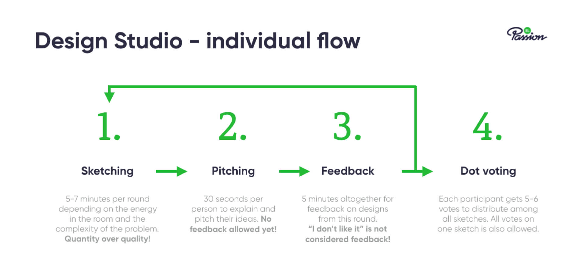
The way you decide to organise the workshop depends on the number of participants. If you have 2–6 people in the room, it’s alright to let them sketch, pitch and critique on their own.
Each person will have 5–7 minutes to sketch out their solutions, 30 seconds to pitch and after that, assign 3–5 minutes for a free-for-all feedback. Once everybody has taken a peek and commented on each other’s solutions, it’s time to repeat the process, but this time, ending it with a quick dot-voting session. Remember that keeping time is key - if you’re not strict enough, the whole structure will collapse.
I always ask participants to feedback and vote, but not only on particular elements or aspects of a sketch they think will work for the interface. Sometimes a full screen is not great, but there is one little feature that could be a game changer for your product. Design Studios are all about iterations and inspiration, so each little piece you design might be a stepping stone or a missing piece for somebody else’s solution.
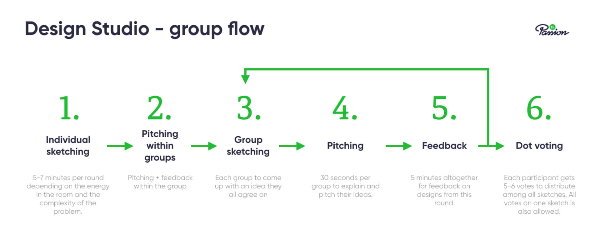
Group Flow
For 7 or more people, it would take too much time to iterate through each activity around the room, so in that case split participants into groups of 2–3 people. This will change the flow a bit, with individuals presenting in small groups and then working together to produce one big idea.
The more ideas flying around the room, the more tiring the session is for everybody. Splitting participants into groups also helps to reduce the effort required from participants to analyse each idea presented. You will only have to worry about understanding the ideas within your group and later on, a couple of big ideas from the other groups.
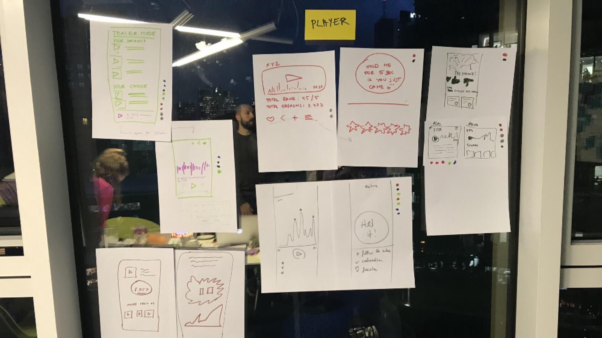
 An example, partial output from a Design Studio.
Activity Breakdown
Now that you have the basic idea of how to run this kind of workshop, let’s do a quick run of each activity to ensure everything runs smoothly and you are comfortable with each step of the process.
Sketching
In Design Studio it’s all about quantity, not quality — the sketches are supposed to be rough! No time for makeup here! This part of the workshop is always divergent — we’re supposed to explore many different layouts, approaches or concepts.
Remember these couple of tips when you crack on with the sketching:
- Everybody should have a good stack of A4 paper and a couple of sharpies for their sketches.
- There should be no talking during this activity, except for quick questions for clarification — it can be very distracting, especially when you have only 5 minutes to draw, which may be stressful on its own.
- Once you explain the whole concept to the participants, it’s good to do a test run by sketching out something ridiculous and checking if the team understands the formula. I conducted a workshop for an app with erotic audio stories for women, and I asked the participants to design a chair for a woman that would use their app. The sketches were a total blast and it helped break the ice and engage everybody in creative thinking.
- It’s usually dead silent, so you may consider some nice background music (I recommend the Mellow Beats playlist on Spotify).
- This is a good time for the facilitator to fill up the water jug or bring more healthy snacks.
 A Product Design workshop at EL Passion
Pitching
This part is for participants to present and pitch their ideas. Each of the participants needs to show and explain their designs to everyone else, so that everybody gets a chance to take a peek and critique later on. A couple of tips on this one:
- Again, no interruptions — pitching from all participants comes first, only then you can progress to critiquing.
- Participants can stand up to present their sketches, but don’t have people come up to a certain spot in the room (in-front-of-the-whole-class style). You will lose too much time between the pitches.
Design Critique
This is a tricky one — so many people on executive levels are used to saying “I don’t like it, so it’s a bad idea”. Well, the Design Studio does not accept such hollow feedback. Everything should be constructive and relate back to the requirements, the objectives and usability of the product.
The facilitator’s role here is crucial — he/she will need to make sure things are kept civil and avoid aggressive or condescending language. In a Design Studio everybody is equal and should have the freedom to express feedback — no matter if they are a CEO or a customer service agent.
- Don’t go around the table and ask everybody for feedback — they may not have anything constructive to say and you don’t want to waste time listening to somebody who’s trying too hard. One 3-minute session for everybody will be fine.
- As a facilitator, you can critique the designs too, your role is not limited to only that of a moderator and time-keeper.
- Participants can (or in my opinion — should) comment not only on whole screens, but also on particular elements of a design.
Voting
In order to have a tangible output of the session, the team should collectively choose the best solutions, all things considered. One of the best ways to achieve this is voting.
Instead of yea’s and nay’s, grab some dot stickers, dispense them among the participants and let them vote for the best elements of the present solutions.
A couple of things to consider here:
- In theory, voting should be anonymous, but in practice it’s a bit hard to execute. The least you can do is to ask everybody to make their choices in their heads and then just come up and distribute the stickers.
- No talking during this activity!
- Give every participant 5–8 dots, depending on the number of people in the room and the size of the interface. Interfaces that have a lot of elements on particular screens will require more votes, as participants may vote on every little feature.
- Sum up the given votes, so that everybody is clear on what was chosen.
Summary
When I finish a workshop, I run through the sketches to sum up and appreciate what the team has accomplished during the day. It gives closure to the session and to the day of intensive work.
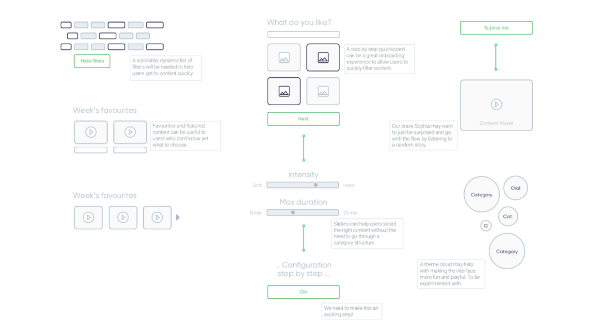
A summary document, written up for the client or for internal use, should contain a list of problems addressed during the session, an outline of the knowledge used and the sketches produced during the workshop.
The form of the sketches depends on what happens next with them. If the workshop is a part of a design project, you can keep photos of the drawings and insert them into your summary document. Make sure you put comments next to the sketches — in a month’s time those drawings may not be as self-explanatory as they were right after the workshop.
However, there are situations when this type of report needs to be sent to the client or senior management in the company. In that case, you might want to digitise the sketches and create a sort of a collage of ‘top-voted’ elements. This approach has worked for me many times, mostly because:
- The clients did not get attached to particular initial screen designs
- It allows the report to contain more elements without having to create a 50-page-long document
Design Studio is definitely a method that can help you with your daily work, whether you want to bounce some ideas back and forth with your colleagues or organise an engaging session for the client.
It’s the new way of working. No more sitting behind closed doors, locked in a designer cave until everything is complete. Collaboration is the key to successful design and many of the greatest product design teams in the world use it to their advantage. Make sure you join them!


