8 December 2020 (updated: 23 August 2022)
Case Study: Redesigning Nixa - an Innovative Recruitment Platform
Chapters
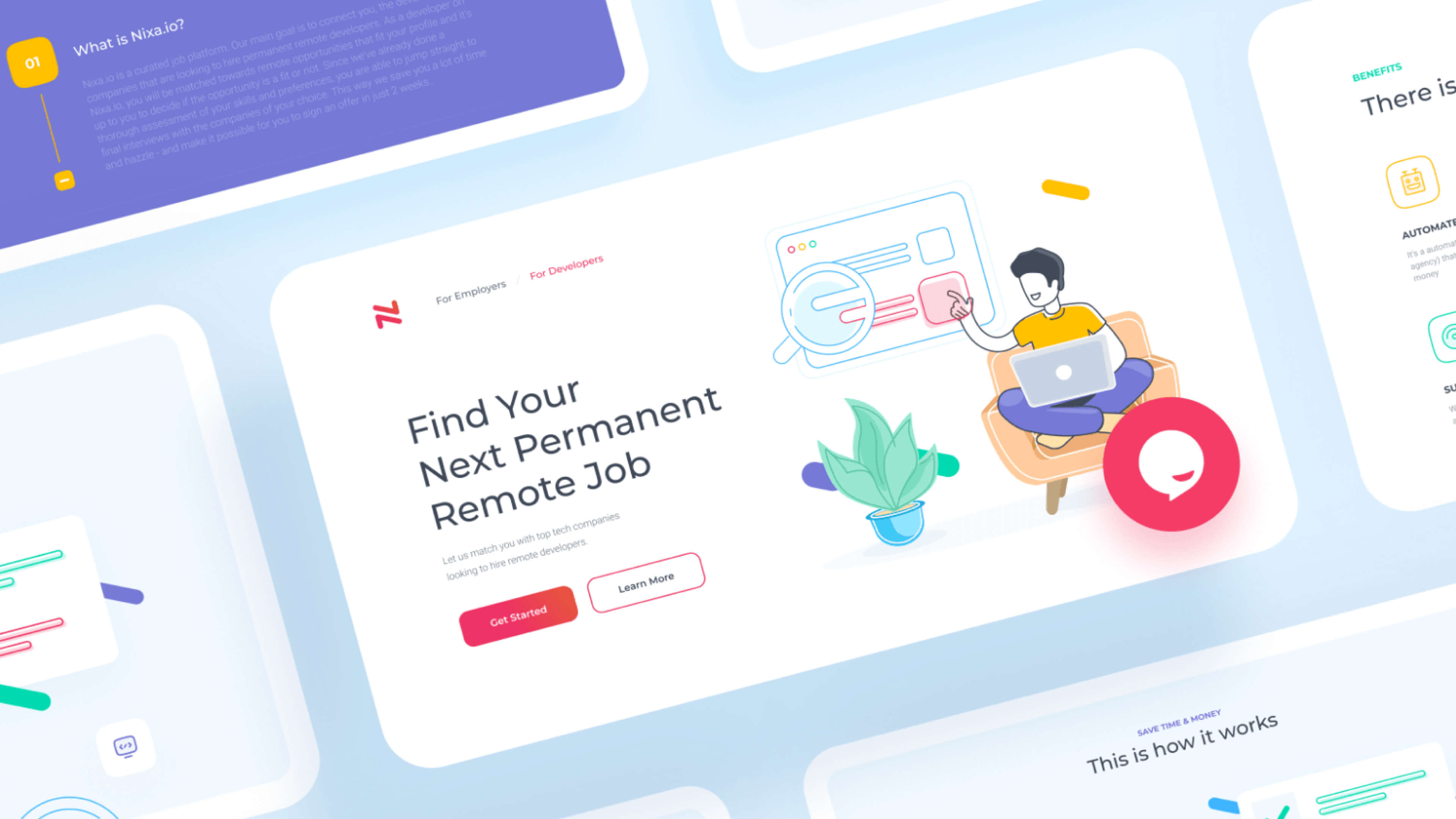
Effective website redesign is taking care of your website user experience issues, and making it beautiful along the way. See how we helped Nixa skyrocket their conversion with UX & UI redesign.
The Client
Nixa connects IT talent with their next remote position. Their platform is a very much needed link between the technical talent, and companies looking for IT employees, with utmost focus put on the skills and expectations match on both sides.
The Redesign Results in Numbers
-
116% increase in website visits
-
4200% increase in conversion rate
-
9333% increase in submissions
The Challenge
Nixa needed to redesign their landing page and improve their user journey. All the functionalities were there, but as their brand grew, the team realized that some of the features needed reorganization and that design can become their core competitive advantage.
Nixa’s core element, the signup form, had around 60% dropout before the redesign, and needed to be simplified.
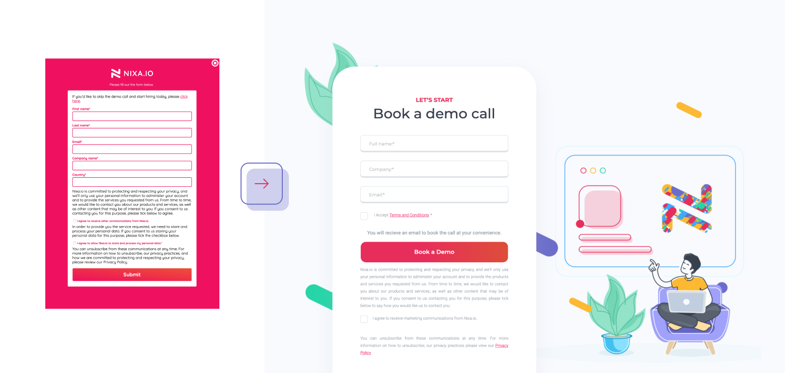 Nixa's signup form before the redesign (left) & after (right). Cleaned out and calmed down for better readability.
First, User Experience
Nixa’s website needed a couple of user experience tweaks. The navigation was unintuitive, the links would take the user into an unclear direction. After studying Google Analytics and Hotjar stats for the website, we discovered that users would click for more info, only to never find what they were looking for.
We proposed to ease out the website navigation, and highlighted the most searched for sections of the website: FAQ and How It Works, for seamless User Experience.
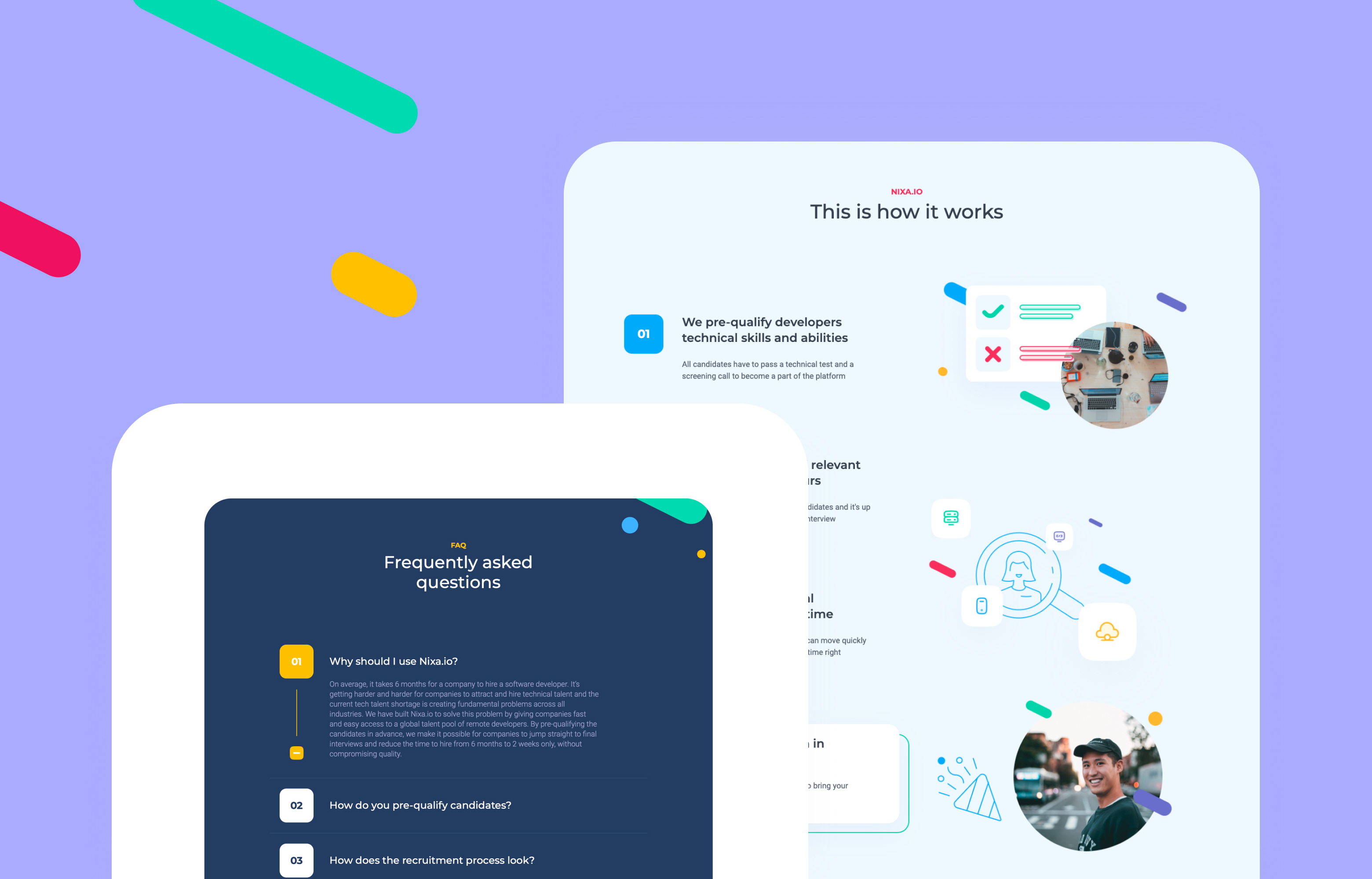 Nixa's FAQ & How It Works sections after the redesign.
User Interface With A Twist
Nixa needed their website to stand out from the crowd to establish their competitive advantage. In the recruitment industry, it is hard to build a long-lasting relationship, to make sure your candidates and companies will come back.
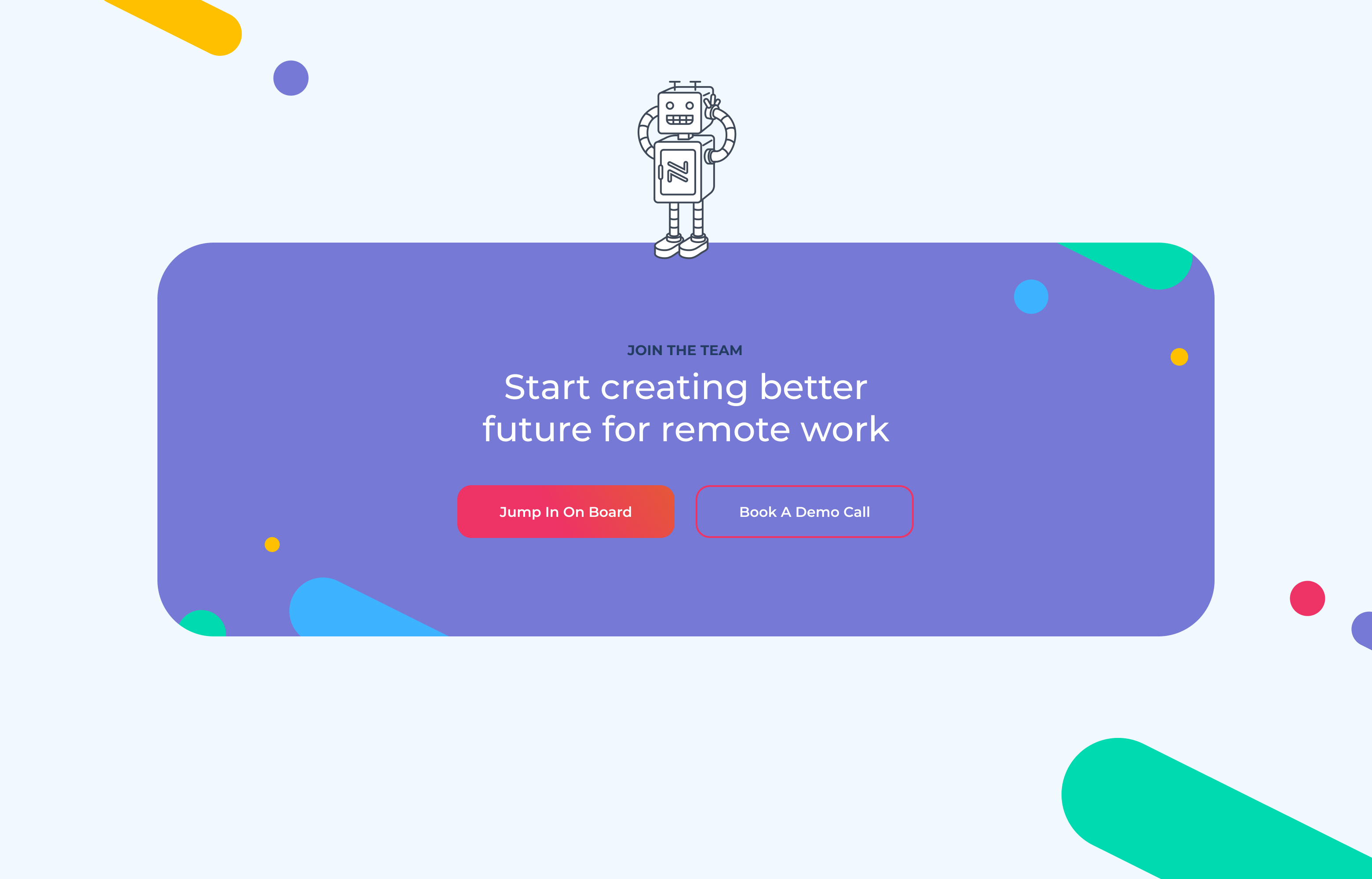
Custom-made icons and illustrations are an essential part of Nixa's new landing page.
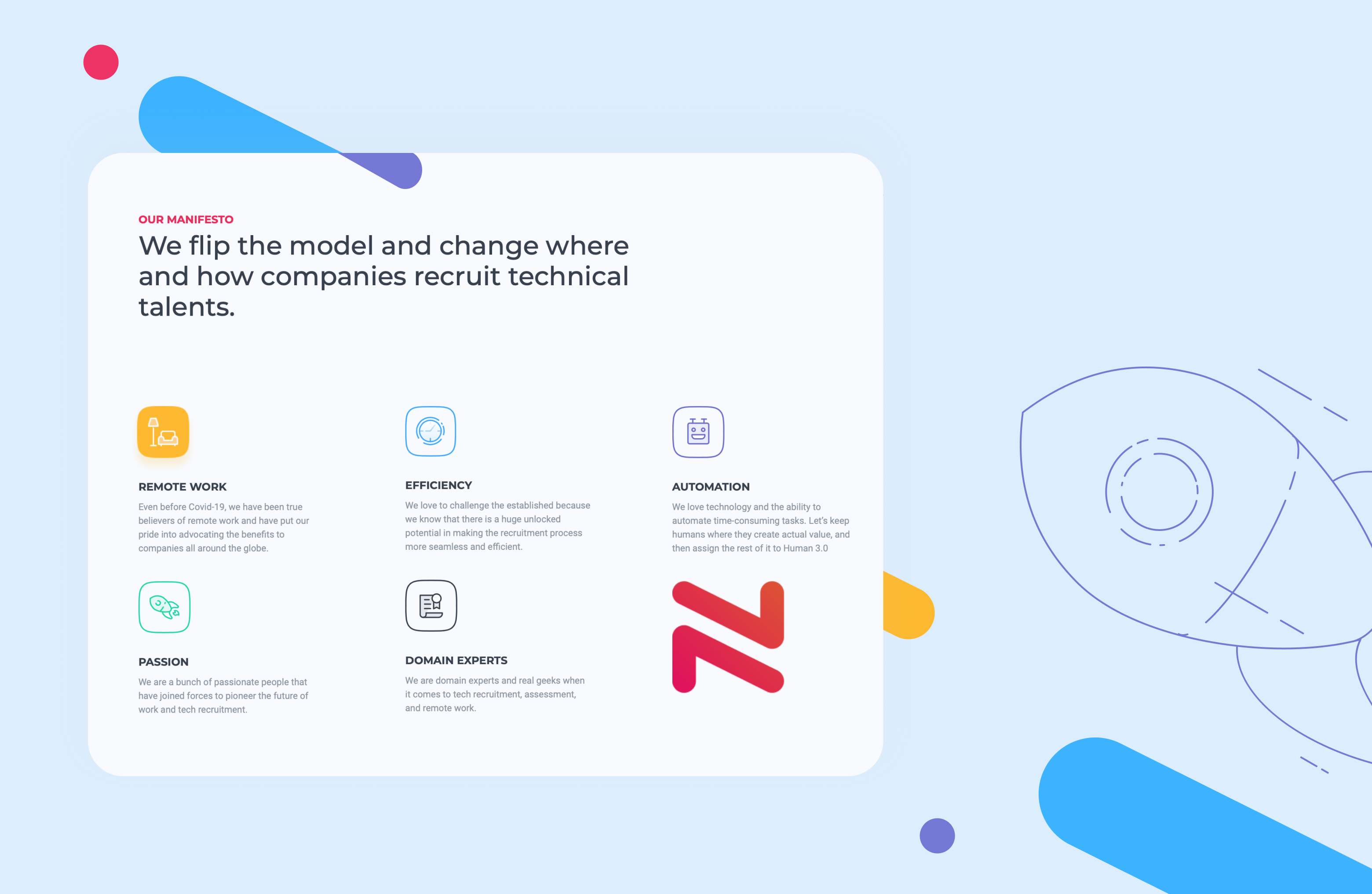
We simplified the designs to encourage this relationship and to make the website more accessible and usable. The subtle colour palette makes the experience engaging while still keeping things professional.
You will also like
- Case Study: Redesigning the HBO VOD Experience: see how we gave HBO Max a makeover based on extensive research with HBO Go users
- 5 Things to Remember Before Your Website Redesign: your checklist of what to do before starting any redesign project


