17 January 2022 (updated: 17 January 2022)
7 Product Design Trends to Watch in 2022 - According to Designers
Chapters
See product design trends to keep an eye on in 2022 — according to the Product and UX designers themselves.
With the consumer behavior changing so much over the last two years, product design needs to follow to serve the new and the evolving users' needs.
We gathered our very own designers' insights and predictions about what's going to shape 2022 from their perspective.
Planet-centric design: beyond the human
 Gosia Chomentowska, Senior UX Designer
There have been many UX paradigms that changed creators’ focus over the years. The clash between system - user - business that puts emphasis on different areas of the product creation process never ends, it just evolves. We have been talking about user-centric design (UCD), human-centric design, system-centric design, and product-centric design. Now there is a new angle to consider in the design process - planet-centric design or environmental-centered design.
It’s high time we shift our perspective and take a wider view on our job and its effects. Planet-centric design implies that in the time of our limited response to climate change (which many still call into question) we: developers, designers, as well as the product stakeholders, are equally responsible and obliged to think bigger and to consider the long-term effect of our work on the ecosystem.
We are not only talking about the social changes that can go by new products, but also its impact on the environment itself. That topic has been signalized in the early 80s in the books by Victor Papanek “Design for the Real World. Human Ecology and Social Change'' and “The Green Imperative” which are now easily considered classics.
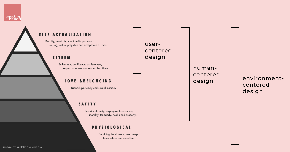 Actant Mapping Canvas from Tools for environment-centered designers.
When user-centered design focuses on growth needs such as self-actualisation and esteem, human-centered design goes even further and includes love and belonging as well as safety. As you may see by now, none of the current mainstream approaches takes into consideration the basic human needs (physiological needs) such as breathing, water, food, sleep. They used to be taken for granted. Sadly, they are not, even hardly so. If we start to think of planet-centered design as simply “not cutting our own throat” we will go full circle and land back to our human-centric approach. Basically, we need to stop seeing the planet only as a resource to plunder, and acknowledge its potential to fulfill our most basic needs.
Pro-environmental approach also supports a new European Union Priority that strives to make Europe the first climate-neutral continent - A European Green Deal.
That is why new approaches are called into action. To name a few: using non-human personas, a new business canvas (that helps us consider and predict a product’s impact on the environment). If you feel like catching on this next wave, follow these think tanks that are already ahead in this approach:
- Impossible (with their new canvas for planet-centered design)- https://impossible.earth/pages/intro/
- Climate Designers (focus on the climate crisis as it is) - https://www.climatedesigners.org/
- Planet Centric Design Website which provide you with strategic toolbox on how to make a great and responsible new products - https://planetcentricdesign.com/
Inclusive language in digital products
 Mateusz Augustynowicz, Product Designer
Accessibility is not a new topic for any designer. We meticulously pair colors, we remember about alternative text under websites’ images or landmarks which help people with disabilities to navigate websites. It’s time we understand the power of language and phrasing in design. Inclusive language builds trust and contributes to the feeling of safety, but in my opinion it is still a trend, and not an industry standard — as it should be.
Everybody has heard about the power of words. It’s the same in an interface. Words have the power to make people feel included and taken care of by a product, the same they have the power to exclude. In many contexts, gender-marked language (e.g. he/she, ladies and gentlemen) is actually redundant and we can just use “they” or “everyone”. An “allowance list” bears the same meaning as a “white list”; “fantastic” may mean the same as “crazy”, sans all the hurtful connotations the latter may have for certain groups of people. It’s not a whim, it’s about respect and making a significant change in the world we’re so used to living in.
When writing copy we should always remember about the “Global First” rule. The ultimate goal is to be understood, not overly sophisticated. Even our target group may use different cultural contexts depending on the place they live, so a reference to a popular actor at one place may give your users’ some laughs, but it may be completely missed in another context. Have a look at the potentially harmless term “to wear a green hat” will actually be a big cultural faux pas in China. A tip from me. Need a helping hand to check if your content is understandable enough? Check out HemingwayApp.
Inclusive language is about respect and equality, but it’s also good for business. The more inclusive the app, the better your scaling and business prospect, which for many apps out there is a must to reach satisfactory revenue. And on a totally human level, the Internet is for all of us. Let’s treat each other with the respect we deserve and have the right to expect.
Non-fungible tokens (NFTs)
 Magdalena Stefańska, Intern Product Designer
Last year, NFTs appeared (for many) completely out of the blue. A lot of people were wondering what they are, how they work, and probably, they are still wondering what the fuss is all about. Non-fungible tokens (NFTs) are still very much in trend, and the ever-growing interest in the NFT technology is hard to ignore.
With NFTs everyone has an opportunity to take part in a virtual art auction. What’s even more crazy, we actually have a choice who we want to be: an artist or a buyer, all without a middleman. You can buy or sell digital assets based on the Ethereum blockchain and then trade them. NFTs function as a proof (somewhat a certificate) of ownership of virtual or even physical assets. Every token has its unique value, which of course depends on many factors (e.g. Van Gogh's painting is desirable, because of its originality, amazing history, and unique style). But pretty much anything can become art. There are no rules. An important side note is that NFTs are becoming popular not only as art certificates. We can observe a growing community for sports, real estate, tickets, events and “widely understood” collectors' items. But still, in the light of NFTs anything can become a collectors’ item if there is a market for it.
A designer's role in all of this is to observe and identify trends, and to understand their power. And we need to state this: NFTs are not that easy. First, you need to have some understanding of the process itself, then to be able to grasp it from a legal point of view. Remember that NFTs, just like any trendy topic, attract thieves and scammers. The topic itself has also been a part of polarizing discussion. People are arguing over the mining costs or the actual need for NFTs existence or it being just another sign of snobbery.
But if you can understand all of this, you can win a lot. NFTs are a great opportunity for creators and acquirers alike. They generate huge revenue streams. As usual, it depends on you what you will do with the knowledge you have.
A thing about scrollytelling
 Patrycja Górka, Product Designer
What is scrollytelling? It’s nothing different than telling stories while scrolling, as the name rightfully suggests. Scrollytelling is your best bet to first capture and then actually keep the users attention. It works like this: imagine you want to learn more about a specific product. You visit a website and, while you are scrolling through various elements, you see a specific story unveiled. Usually, from the marketing perspective, it would first describe a problem, and then offer you a solution to the problem you’re facing. When it’s done well and narrated well, of course you're going to scroll to the very end.
Why do we need stories on websites? These days, a lot of product websites follow the same UX patterns. This, from the usability perspective is good, but it can make your product’s value proposition on the market a bit dim. While doing user research, you may discover that people struggle to differentiate between 5 different websites of local gyms, because they are designed according to the same pattern. And as a result of this, people don’t know which one to choose and spend their money on.
That's where we as designers should always strive to elicit something recongizable about a project to make it unique. And conscious play with visual content and witty copy is one of the possibilities to differentiate your product from the crowd.
The most important thing is that today people don't read, they scan. But if you create an interesting story this problem disappears like a soap bubble. Engaging stories makes people read. If you don't believe me, see this website - https://illuminating-radioactivity.com - I bet that in 10 mins from now you will be on its footer!
Personalization is a thing now
 Dominik Dutkiewicz, Junior Product Designer
Google spoiled us in 2021 with the new version of their Design System, which initially appeared on Android 12. I’m talking about Material Design 3 (Material You). This version is all about the users. Google gives you the ultimate power over your apps, allowing you to personalize their look and making it more unique.
Personalization and customization of apps’ appearance are not anything new. Those solutions have existed as significantly smaller parts of the apps, but on the scale of a whole new Design System? That’s something really exciting! Material Design — a little monotonous and outdated until now, with this update, can give a whole new vibe to the apps that were built on its foundation.
While we’re at it, let’s explain the difference between customization and personalization. There is a thin line between their meaning. Customization is more or less an automated process based on observation of our behavior and adapting the product to our needs individually without any effort from the user. Personalization, on the other hand, is a conscious decision made by the user to set up the product in a way they like to use it. An example of customization would be Netflix suggesting you a TV show to watch, but setting an avatar for your Netflix account - that’s personalization.
There are some differences, but both personalization and customization are there to achieve the same goal: to match users’ needs and interests. Both are a prerequisite of good design, because people’s preferences change. The primary purpose of those is to improve user experience.
With the launch of Material Design 3 Google made a significant move towards full personalization of their services. With that push, we can only expect more changes in the world of Design Systems, and hence offering more personalization and customization. It’s a matter of time other companies do the same, and I’m convinced that - as designers - we need to enable users to choose their own way of experiencing a solution.
No-code tools
 Michał Mazur, Design Team Lead
In recent years we could observe a steady increase in the usage of no-code tools. Webflow has been leading the pack in the market, with their out-of-the-box CMS and ecommerce capabilities and the upcoming user accounts and gated content. Webflow has been one of the most searched-for topics in the e-learning platform Udemy over the last 3 months of 2021 and we have seen the new Awwwards Academy promote a new no-code course almost every month.
Apart from Webflow, marketers have embraced simple tools such as Carrd (which reached over 1.6 million users), which allows pretty much anyone to quickly build up a simple landing page. We could also say that starting up an online store for content creators has also been made much simpler in recent years through Shopify (and their one-click integration with Stripe) or Gumroad.
Many content creators don’t even need to look for additional tools, as Notion itself has made it so easy to publish a document (such as this one) and share it with your audience in seconds.
Designers are at the center of it all, as small companies around the world don’t need to rely on availability of their development teams in order to launch small and not-so-small websites without writing a single line of code. Needless to say that so many products they already use are ready to be interconnected through automation apps in the likes of Zapier or Integromat. For many small businesses out there 2022 might not be coded!
Take it with a grain of salt: trends tend to fade
 Jakub Dziedzic, Design Team Lead
One of the things I learned throughout my journey with design is that it's the art of subtracting elements, not adding them. Sometimes designers try too hard making it too complex to grasp the product's visual surface. As Coco Chanel once said: "Mode passes. The style remains."
One of the styles that you can learn from product design is the so-called swiss legacy. It owes its name to a style highly associated with a movement in graphic design born in the 1920s in Switzerland. The principles behind that style were craft-oriented, stating that the design's details and precision are the most important things. Thanks to those rules, it served as the foundation for another international style adopted worldwide in the 1960s. "Form follows function" and not the other way around. That was their manifesto.
Having that in mind, think about how you can portray your product's abilities in the best way possible, starting with their purpose. Don't try to force a particular style, just because everyone else right now is trying to copycat it. Chances are it will become quickly overused, and everyone will get bored with the idea; therefore, you will need to redesign everything quickly once again. I just want to encourage you to think about what your idea will look like 3 to 5 years from now. Is it still going to be "trendy"? "Nah, this time, I'd do this differently! It looks so old-school!" - you can hear yourself from the future.
Try to avoid that situation and not become a victim of what's hot right now. Flat shadow is no longer a dominating type. Illustrations are once again losing to the photos. Hoping on the hype train, just to get a few likes here and there, is a short-sighted approach. Think about your user group, product industry, and do not follow one catchy trend without hesitation. Always ask yourself if that's a good idea and will still look neat in upcoming years, or it's just a temporary thing, but most importantly - does it serve the functionality first?
Check out also
- How to write a perfect UX brief for your next project? - A well-written UX design brief is a foundation of your cooperation with an agency. See the must haves of a UX design brief.

