7 July 2020 (updated: 4 December 2024)
UX Audit: A Quick Win For Your Digital Product
Chapters

When your digital product's performance drops and you're losing sales, a UX Audit is the best (and the quickest) way to find out why.
When you're seeing a significant fall in some of your key metrics, you start to search for possible reasons.
- Why aren't people signing up?
- What's stopping users from converting?
- Why they're not using that awesome new feature we spent so much time on?
Many businesses still build websites and apps based on their stakeholders’ “gut feeling”, not spending enough (or any) resources on actual user research. But as the users’ expectations grow higher, the competition grows stronger, the consequences of bad user experience are becoming more and more severe.
And this is the possible reason behind your stats dropping: your users might get stuck at one point of their journey, they might not understand certain things, or the feature you spent so much time on, might not be communicated well enough in the interface.
But wait a bit with that redesign plans
A website redesign may be a long-term solution to your problem. But it goes without saying that a redesign done well is a complicated process that usually takes a few long months (or in some cases years!) to implement. And during those months, your company will continue to suffer from the so-called Costs of Inaction. With the numbers still dropping, you continue to lose prospective deals and/or conversions, so, to put it bluntly, you continue to lose money.
You might be tempted to push your website redesign at the top of your priority list to launch it ASAP, but rushing into things may only help you to make the same mistakes all over again.
Both scenarios do not sound very appealing and are definitely not good for business. So where should you start when your website is not getting sales?
A UX Audit is your best bet, as it is the first step towards a better understanding of what your users want, need, and expect from your website or app.
In a nutshell, a UX Audit is like a doctor's prescription. It's a handful of ready-to-implement insights you can benefit from, both for now and in the long run.
After a UX Audit, you get a thorough list of guidelines and recommendations, so you know exactly what to do next, and, more importantly, how to do it.

UX Audit - what is it?
A UX Audit will help you to:
- find out what’s not working, or seems too complicated for the users, so they bounce,
- understand what is working well, and how to scale it for even better results,
- establish priorities relevant from the perspective of your business objectives, and the order in which the improvements should be implemented,
- discover so-called “low-hanging fruits”, so the seemingly tiny improvements that can bear a huge impact on the overall success of your product.
The tools and methods used in a UX Audit may vary significantly, and they should always be chosen individually, case by case, depending on your product’s issues and the objectives you want to achieve. Some of them include:
An expert evaluation
A UX Designer goes through your product (or its chosen elements) to identify potential barriers for the entry-user.
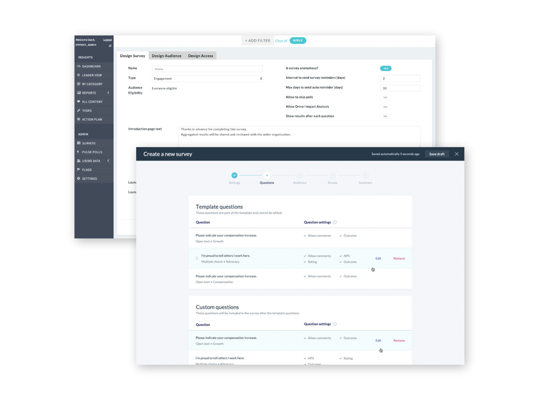
With an expert evaluation, we were able to help Hyphen, an employee engagement analytics platform, with their application’s whole architecture. Before the audit, it was very dispersed and hence, unintuitive. We were able to propose a new ready-to-implement approach that felt more natural and helped users navigate through a vast number of existing functionalities.
User Testing
It’s a number of sessions with your prospective users chosen beforehand aligned to your target group. They can be conducted either face-to-face or remotely, depending on the project’s possibilities and restrictions. It’s a crucial tool in making and validating design decisions. You get unbiased feedback from participants, who, in the end, could be your potential users.
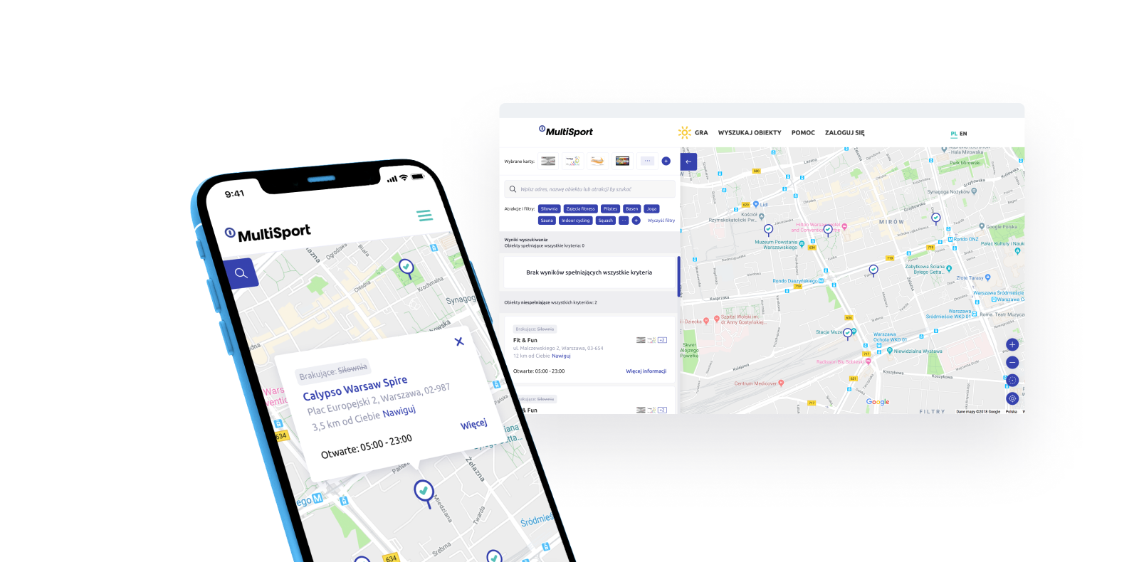
Thanks to user testing we did for Benefit Systems’ employee sports & wellness benefits program, we were able to elicit the pressing issues in their core functionality: the search tool.

We discovered that the search, previously narrowed to addresses, is simply insufficient, as users are more likely to search for facilities based on the district area for a broader choice of options. The implemented filters turned out to be “invisible” for the users, and they perceived them as static icons. We proposed implementing more conventional checkboxes, which increased both predictability and accessibility from the users’ perspective.
Quantitative analytics review
With the use of Analytics tools (i.e. Google Analytics, Heatmaps), a UX Designer gathers current usage statistics to understand the users’ behavior within your product and determine the points that need improvement the most. It’s a good solution if you’re unsure where and how your product is underperforming, or the performance has dropped significantly, and you can localize the possible reason yourself.
Accessibility review
A UX designer x-rays your product through the lens of users with various disabilities (i.e. hearing or vision), or possible users' restrictions, like computer literacy or even age. The goal is to identify the critical issues they face while using the product.
The accessibility review can be of particular importance for products in a healthtech industry, where inclusiveness bears a great impact on the app's or website's overall performance and results.
Don't be your own UX auditor
Human minds are prone to bias. After interacting with a product for some time, it learns its ways around even the most difficult or unintuitive things. Then, you tend to put your focus on fixing very complex issues, while failing to see the obvious ones your entry user is most likely to struggle with.
This is why you need a fresh pair of eyes for your audit. You need someone to look at your product holistically, without prejudice or sentiment, and someone able to draw relevant conclusions, based on research and hard data.
Why UX audit is important?
No matter if you're headed for a full redesign or just want to build on what you already have, a UX Audit is the quickest tool to help you pinpoint the good, the bad (and the ugly) of your digital product. Based on the recommendations, you'll be able to implement decisions based on research and hard data, not your gut feeling.
A digital product fueled with good UX is a lot more likely to give you better customer retention and upbuild your customer loyalty. Both of these factors contribute directly to boosting your sales and conversion. But you can't really do it without acknowledging your users into the equation.
You might be interested in:
- 5 Things to Remember Before Your Website Redesign: if a UX Audit is your first step towards a complete redesign,
- Redesigning the HBO VOD Experience: A Case Study: if you're curious to see redesign process in-depth, and in a user-centred way.


